GaussView Basics
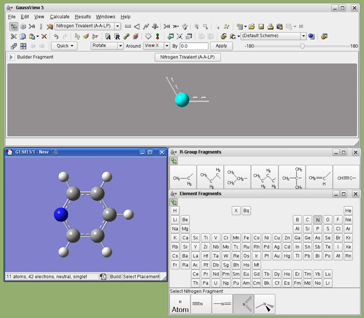
The main GaussView interface consists of several windows, in addition to other dialogs which appear in the course of working. Figure 1 illustrates a simple session in which the user has just started to build a molecule.
Figure 1. GaussView on the Desktop
Several GaussView features are visible here. At the top, we see the main GaussView control panel, containing the menu bar, a variety of toolbars, and the Current Fragment window. Below this, on the right, are the palettes used to select functional groups and individual atoms for addition to a molecule (note that these can function in a modal or amodal mode, according to user preference). At the bottom left is the active View window containing the molecule being built.
The GaussView interface consists of these main components:
The toolbars that appear by default under the menu bar in the GaussView control panel are illustrated individually in Figure 2. The Builder toolbar can also appear as a standalone palette, as it does in Figure 2. You can open it with View=>Builder. You can detach an individual toolbar from the main toolbar by grabbing the handle and dragging it out of the toolbar area. To reattach a standalone toolbar, either drag it back into the main toolbar or double click it.
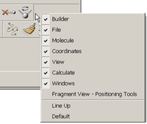
Figure 2. Toolbar Context Menu
If you right click in the grey area within any toolbar, you will bring up the Toolbar context menu. The first section of the list contains the names of the toolbars that are available in that window. Selecting one of the toolbar names from the list will toggle it between its visible and hidden states. The Line Up option causes the toolbars to move to eliminate empty space between them, and the Default option restores the default configuration for that toolbar (when applicable).
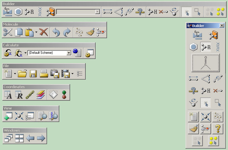
Figure 3. GaussView Toolbars in Standalone Mode
The Builder palette on the right is revealed with the View=>Builder menu path.
Molecules, Molecule Groups and Views
GaussView uses these constructs to organize the many molecules which are being utilized at any given time:
For molecule groups containing more than one molecule, there are two display modes. Single-view mode displays a single molecule at a time. The current molecule number appears in the toolbar. Clicking the single/multiview icon brings up multiview mode in which several molecules can be viewed at one time. Individual molecule views are contained within the larger multiview window. The molecule number is shown in the title bar of each frame. The currently active molecule is shown with a slightly lighter background to distinguish it from the other molecules and is the one involved in atom selections or in the dialogs. Clicking on one of the individual molecule windows that is not the active molecule window will cause it to become the active molecule. In the event that not all of the individual molecules can fit in the View window, a scroll bar at the bottom of the View window allows one to move between the different molecules.
Clicking on the small triangle to the right of the single view/multiview icon reveals a small menu containing these items:
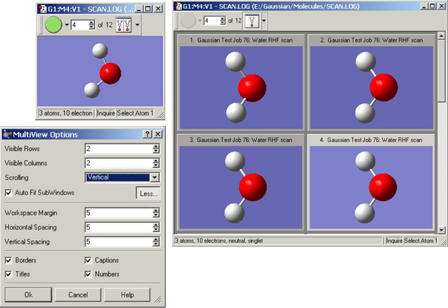
Figure 4. A Molecule Group Containing 12 Molecules
The multiview controls in the toolbar appear only when there is >1 molecule in a molecule group. The single/multiple view icon toggles between single-window (upper left) and multi-window view (right). The MultiView Options dialog controls the layout and behavior of multiview display mode.
View window title bars display information about the current molecule group, molecule and view: each distinct molecule group is identified by an icon whose color is uniquely associated with it. Figure 5 shows the color icons from two different view windows (each corresponding to a different molecule group). All dialogs that are directly associated with that molecule group will use the same color icon to visually associate themselves with their parent molecule group (including new views created using View=>Add View). This color icon is also used to identify the molecule group in the Windows menu.
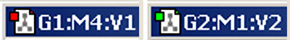
Figure 5. Color Icons from 2 Different Views
The icon on the left corresponds to the 4th molecule in the 1st molecule group (red), while the one on the right is the 2nd view of the 1st molecule in the second molecule group (green). This same color icon will appear in all dialogs associated with that molecule. For some operating systems, the color icon is located in the status bar.
In addition to its color icon, each View window is uniquely identified by its group/molecule/view identifier. This identifier consists of the molecule group (G), the molecule number (M), and the view number (V). Each of the molecules in a molecule group are numbered sequentially starting at 1. If a molecule in the group is deleted, the molecules are renumbered to maintain a continuous sequence.
Note that dialogs corresponding to molecule editing function are molecule-specific. If you activate a different View window with, say, the Atom List Editor open, its context does not follow. Examine the header label of a dialog in order to determine the corresponding View window.
Right clicking anywhere within a molecule window will bring up a context menu. The contents of the context menu duplicates much of the Builder, the menu bars, and the toolbars. This is provided as a convenience for the user.
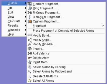
Figure 6. View Window Context Menu
Each of the options on the context menu brings up a submenu containing related items.
The various controls in the MultiView Options dialog have the following uses:
The following controls are visible when the button has been pressed:
Clicking on the green run button in the toolbar for a multiview molecule group will cause the View window to show each molecule in the group sequentially and continue to cycle through the full list until stopped. This has the effect of visually animating the sequence of molecules like a movie. This can be particularly useful for animating a series of related geometries, such as a Reaction Path plot. After the green run button has been pressed, it turns into a red stop button, which will stop the animation.
The small triangle next to the animation button contains a small menu. Its Loop item causes the animation to loop continuously until stopped. The Reverse item cause the frames to be displayed in highest-to-lowest order rather than in ascending frame number order. Note that these options cannot be set while an animation is running.
The animation speed can be controlled by the user. For an individual View window, the animation delay can be changed in the Display Format dialog’s Molecule tab. The default animation delay is set in the Display Format Preferences.
Interaction with molecules is designed around the movements of a three-button mouse. The functions of the mouse buttons are described in the following table:
Mouse Button |
|||
|---|---|---|---|
3-Button |
1,2-Button Equiv. |
Action |
Function |
| Left |
Left |
Click | Insert atom/fragment, pick atom for modification, etc. |
| Click (C key pressed) | Select or deselect by atom, | ||
| Drag (R key pressed) | Select or deselect via marquee. | ||
| Drag Left/Right | Rotate about Y axis. | ||
| Drag Up/Down | Rotate about X axis. | ||
| Center |
Shift-Left |
Drag | Translate molecule. |
| Right |
Ctrl-Left |
Drag Left/Right | Rotate about Z axis. |
| Drag Up/Down | Zoom in and out. | ||
| Click in an open area | Display context menu. | ||
| Shift-Click on atom | Highlight corresponding row in Atom List Editor. | ||
Note that these mouse actions are active in any molecule display (including ones in GaussView dialogs).
Limiting Mouse Actions to One Fragment
If two items are not bonded to one another (not connected by visible chemical bonds on the screen), you can manipulate them individually on screen by holding down the Alt key and moving the cursor. When you use the Alt key, only the fragment closest to the cursor is affected. Thus Alt-Shift allows you to drag only one fragment.
GaussView contains the following menus, which have the indicated general purposes:
A reference table listing all GaussView menu items and toolbar icons is available here.
Default settings for many GaussView features can be customized via the preferences, which are reached with the File=>Preferences menu path. The following preferences are available:
All of the preferences dialogs contain several buttons: (save current settings and exit), (exit and discard unsaved changes), (restore GaussView’s installation settings) and (obtain online help). When you use the button, the dialog in Figure 7 will appear.
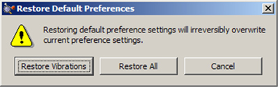
Figure 7. Restoring Default Preferences
When you click the Default button in the Preferences, you are given the choice of restoring all default preferences or only the ones pertaining to the current dialog (here, the default preferences for Vibrations).
We will consider two of the preferences next. The others will be discussed along with the relevant features in the course of this manual.
Specifying GaussView Window Behavior
The Window Behavior Preferences, illustrated in Figure 8, controls how various GaussView window types behave.
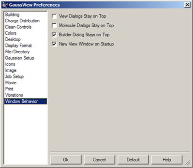
Figure 8. Window Behavior Preferences
These settings allow you to force certain window types to remain uppermost, as well as whether an empty View window is automatically created when the program starts.
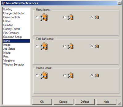
The Icons Preferences allow you to specify the icon sizes for various GaussView windows and toolbars. It is illustrated in Figure 9. The controls in the dialog control the icons for menus, toolbars and the standalone Builder palette. The defaults are small icons for the first two items and large icons for the third one.
Figure 9. Customizing Icon Sizes
You can select larger icons for various GaussView windows with this preference.
The Help=>GaussView Tips menu path opens the GaussView Tips window, which displays various tips for using the program effectively. You can also choose to have a tip displayed each time GaussView starts up using the checkbox at the bottom of the window (the default is unchecked).
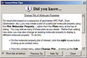
Figure 10. GaussView Tips
Click Show tips at startup to view a tip each time you start GaussView.